A comprehensive case study on the redesign of the meowtle cat sitter & cat parent experience.
Research
Redesign web and mobile apps & website.
Prototyping
Usability Testing
Illustrations
Email templates
Pet care
Vipin
Apr 2021
Meowtel is a platform dedicated exclusively to cat sitting, offering cat parents a sense of security and ease when booking quality, insured cat sitters. Meowtel's mission is to help every cat and cat parent live their best life, catering to a target audience of urban, travel-loving cat owners ages 25-44. With a brand focus on trust, convenience, and peace of mind, the platform needed a redesign to increase conversions, strengthen user experience, and highlight the exclusive benefits of Meowtel.
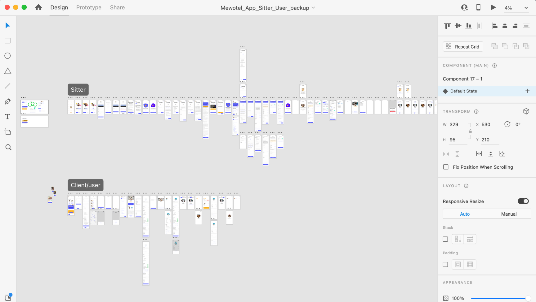
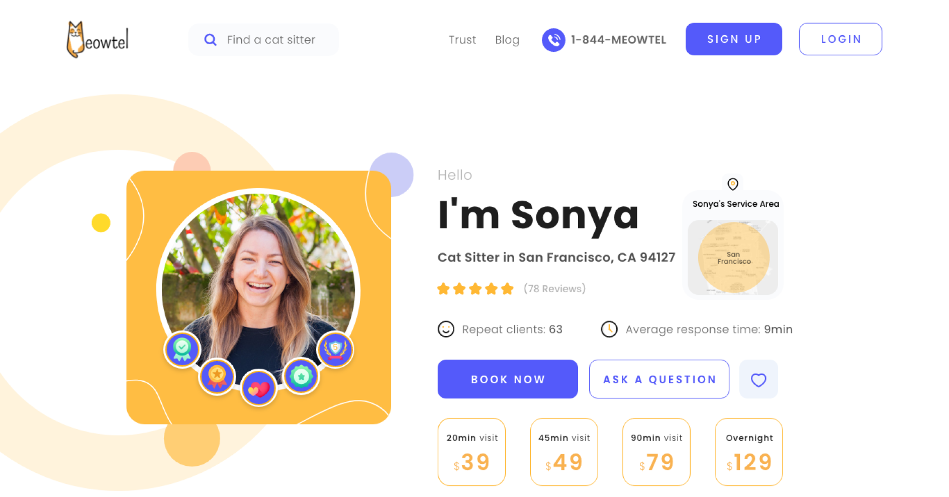
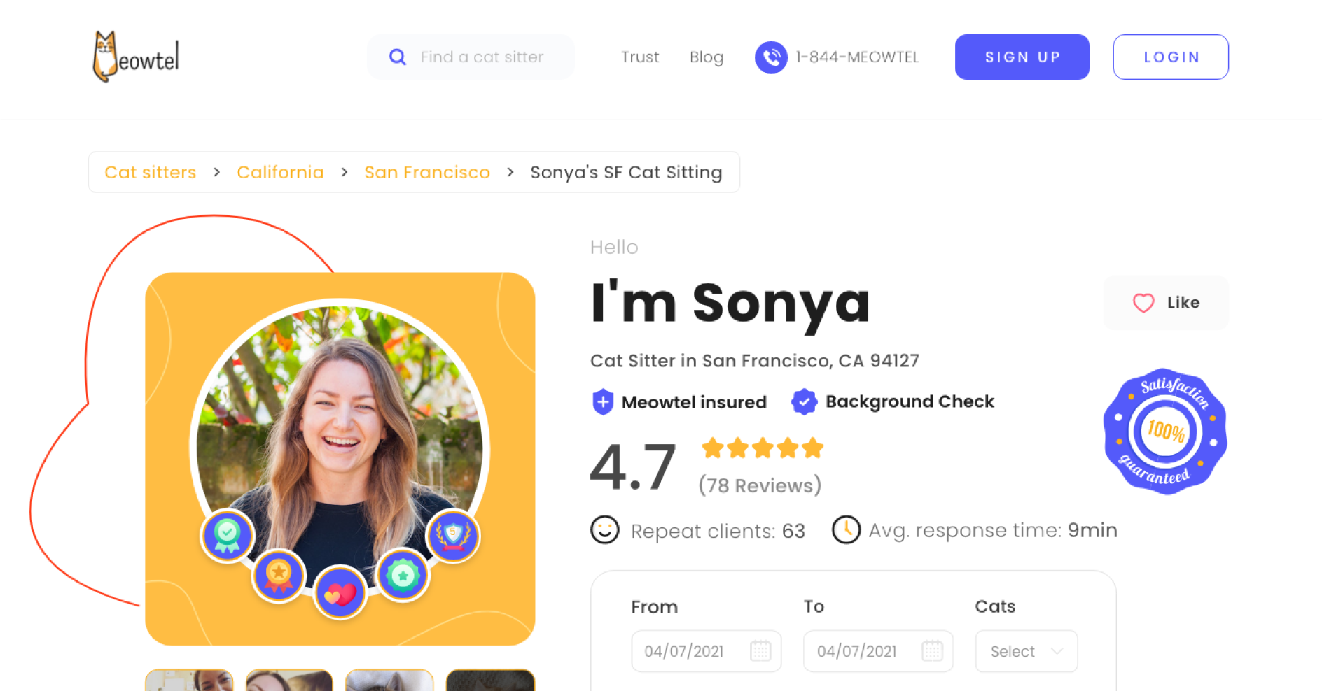
Key areas, including the cat sitter profile, listing page, signup flow, and reservation flow, lacked intuitiveness, contributing to high user drop-offs. Hotjar recordings showed that visitors often hesitated between sitter profiles, making final decisions challenging.
As a marketplace, Meowtel needed a seamless flow that would not only showcase each sitter’s qualifications but also simplify the comparison process for cat parents.
The redesign aimed to address user stress, anxiety, and overwhelm, enhancing feelings of relief, trust, and connection.
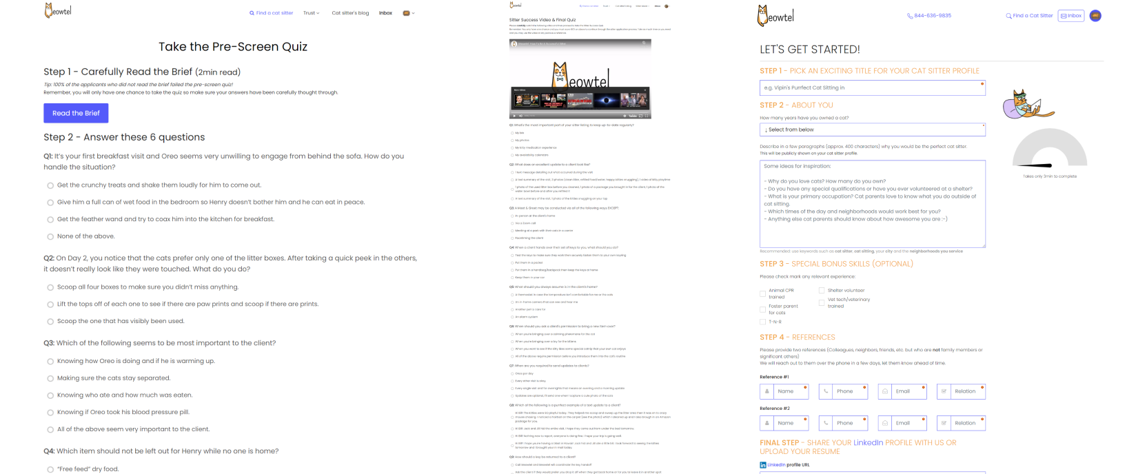
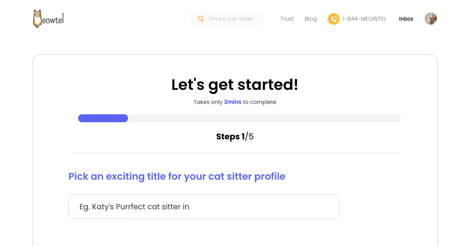
The "Become a Cat Sitter" flow, intended for new sitters, was notably challenging. Sitters had to complete a pre-screen quiz with 6 questions displayed at once, followed by a waiting period, then a final quiz of 20 questions, which added cognitive load and led to friction during onboarding.
To inform the design approach, I conducted competitor research and reviewed the client’s user data.
Competitor Analysis: I evaluated platforms like Rover and WagWalking to identify successful design elements and standards in the pet care industry. These insights highlighted opportunities for Meowtel to differentiate through its exclusive focus on cats while meeting user expectations for simplicity and trust.
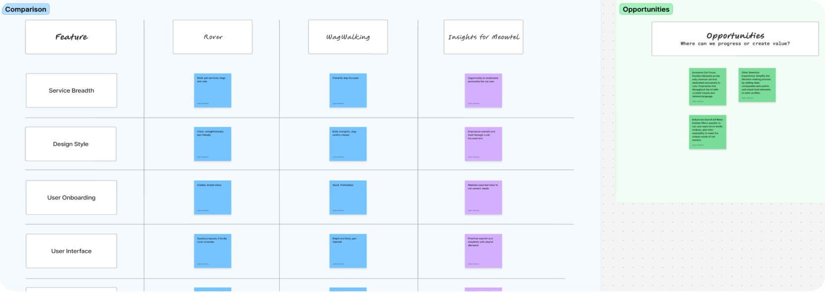
User Research Findings: Hotjar recordings revealed indecision on sitter profiles and high drop-off rates in the signup and reservation flows. This data influenced the redesign strategy to streamline flows and mitigate the burden of information overload.
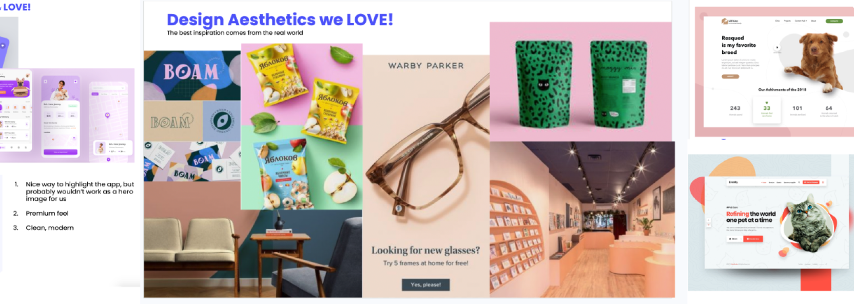
Design Inspiration: I explored designs that emphasized clarity and modern aesthetics. To reduce cognitive load, I focused on a clean, whitespace-heavy layout that retained Meowtel’s inviting, pet-centered feel. To align the playful yet premium brand tone, I reviewed similar illustrative styles that would bring “mascot Cat” to life without straying from the classic design.
Onboarding Challenges: The existing cat sitter onboarding process felt overwhelming and unfriendly due to its single-page quiz layout. To address this, I looked into progressive, segmented onboarding flows that could reduce user anxiety and enhance completion rates.
The design process combined a user-centered approach with iterative testing to ensure alignment with Meowtel’s mission and the client’s goals.
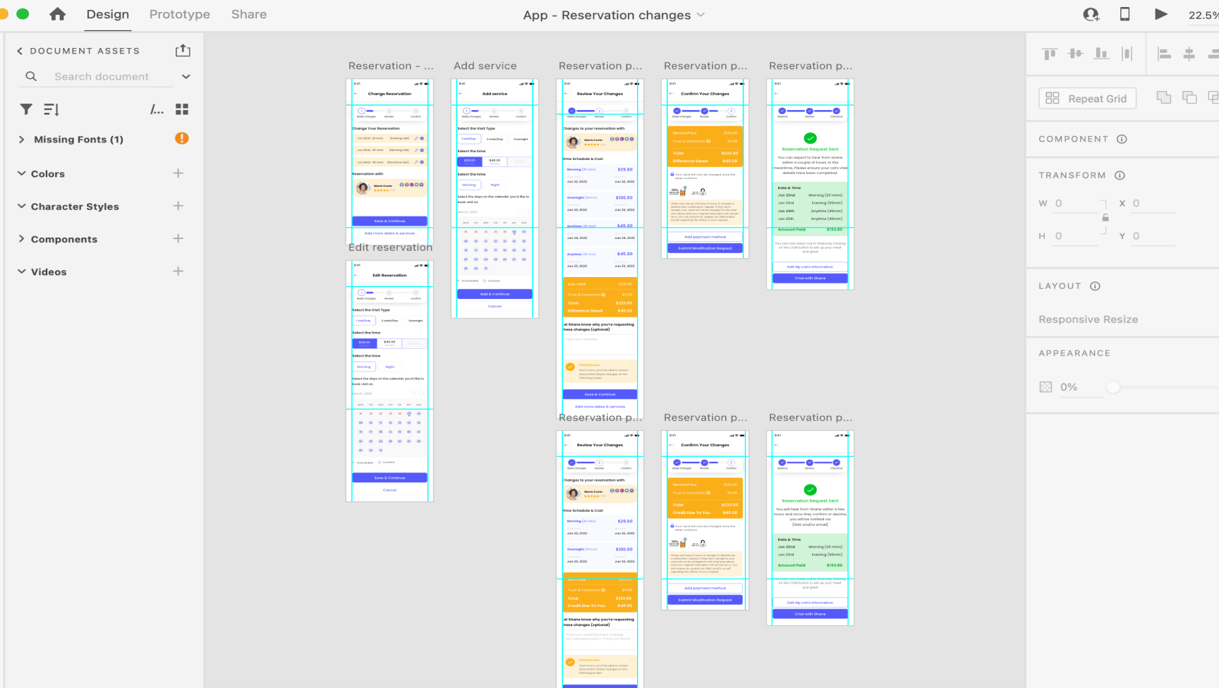
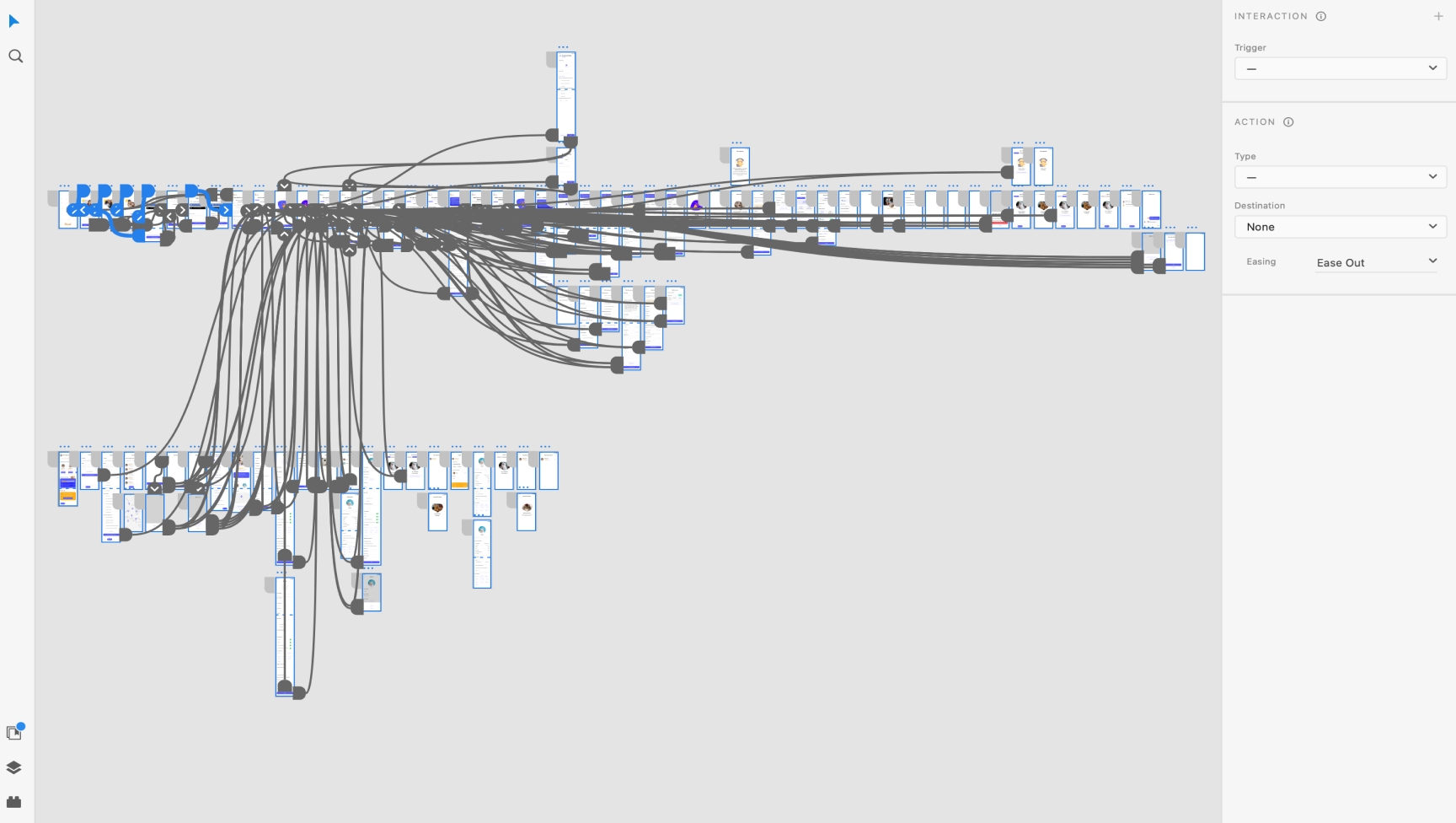
Wireframing and Flow Design: I created user flows for critical interactions, particularly for the reservation and signup processes. To address user hesitation on sitter profiles, I added visual cues and improved layout clarity for faster decision-making. Prioritizing a step-by-step structure with clear calls-to-action to enhance intuitiveness.
Progressive Onboarding for Cat Sitters: To simplify the onboarding process, I designed progressive quiz steps with playful, engaging visuals, reducing cognitive load at each stage. A celebratory thank-you page acknowledged sitter progress after each quiz stage, fostering a sense of accomplishment.
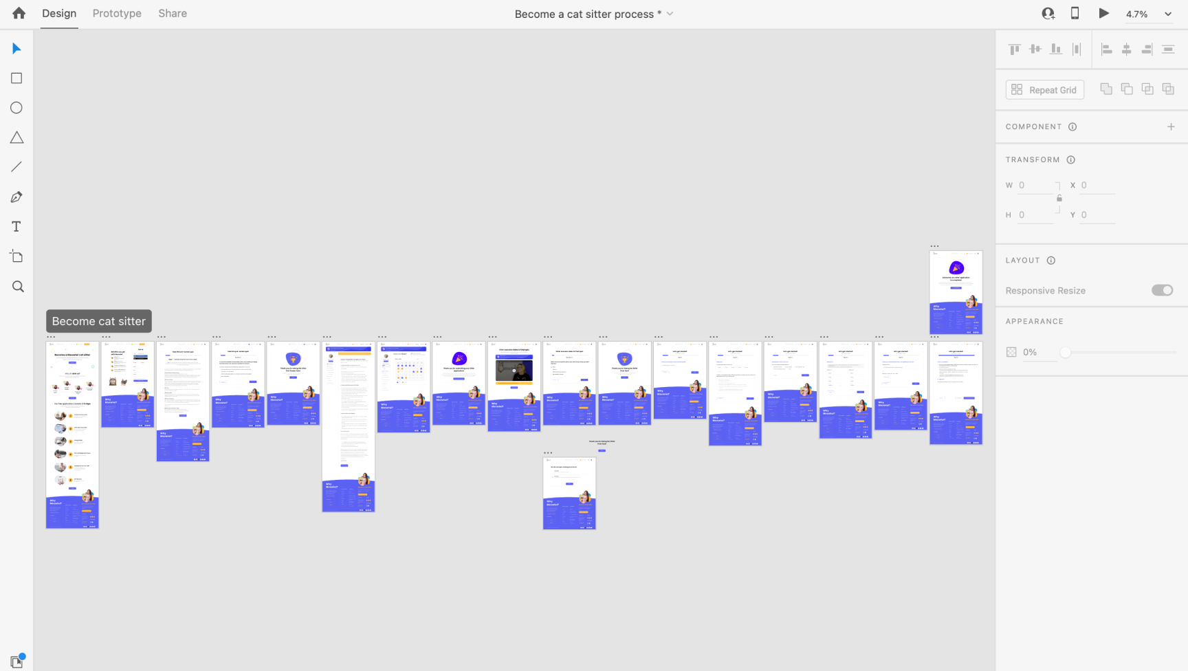
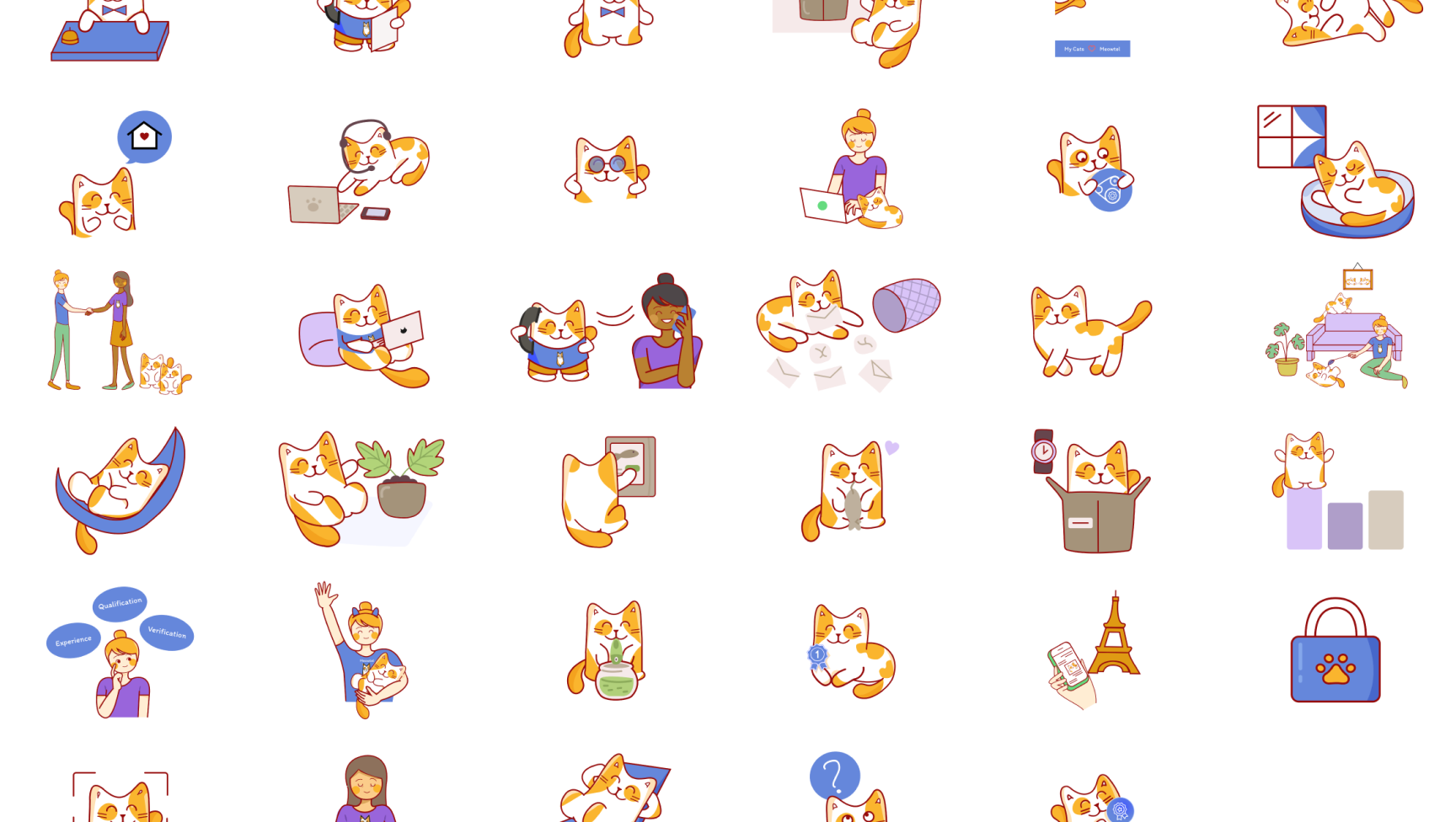
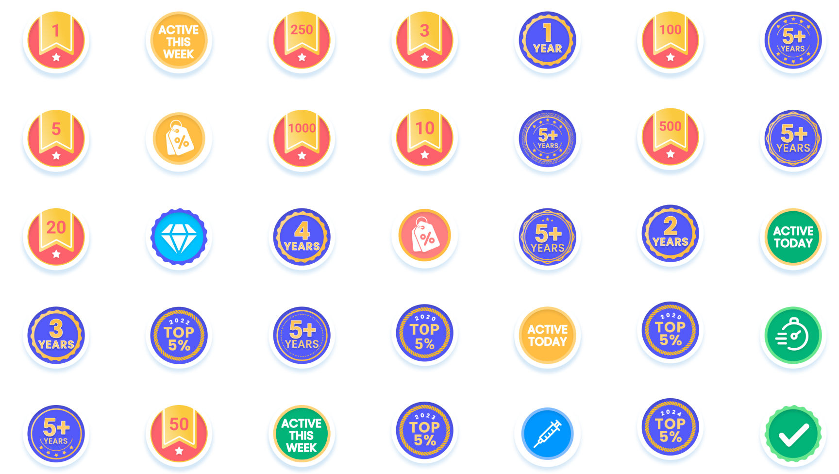
Illustration and Badge Design: Working within brand constraints, I refreshed “mascot Cat” illustrations to add personality and created new profile badges. These badges highlighted sitter credentials in a friendly yet informative way.
Prototyping and Feedback: After developing interactive prototypes, I gathered feedback to identify areas for refinement, focusing on the reservation and signup flows. This feedback loop allowed me to fine-tune the design, especially around reducing the number of steps and minimizing cognitive load.
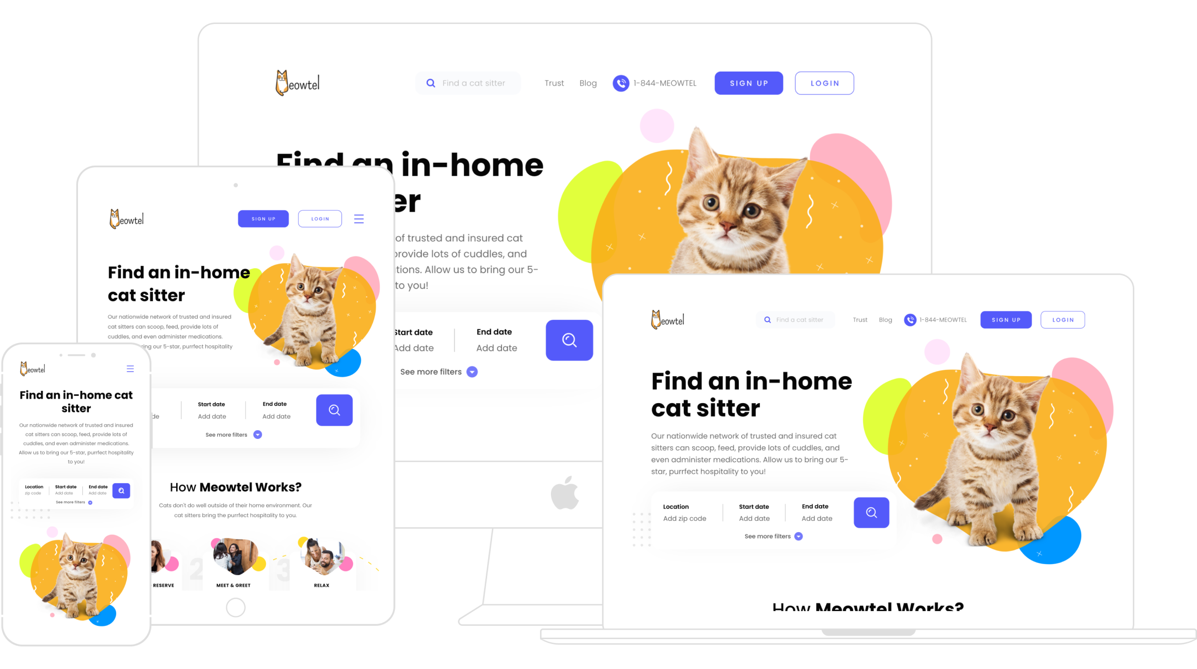
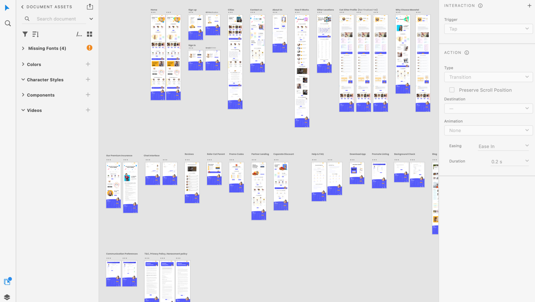
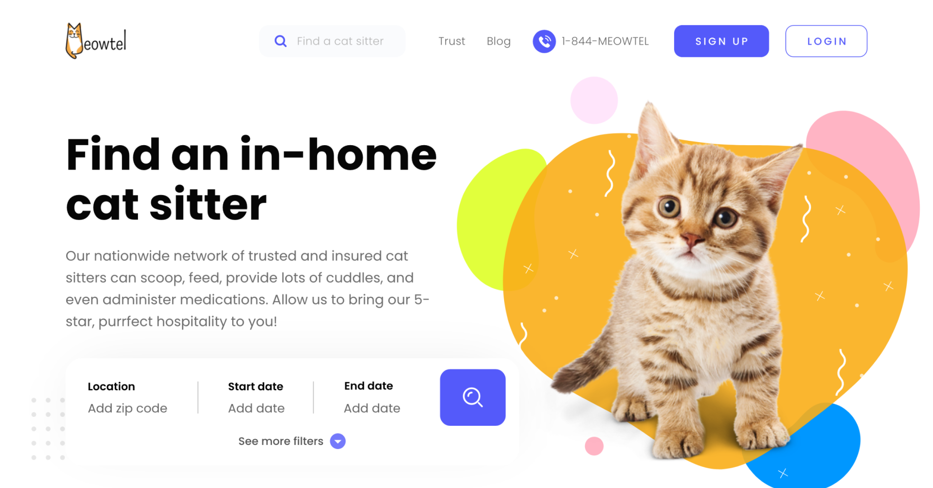
Improved First Impressions:I replaced the slow-loading video with a more lightweight and informative hero section that conveyed Meowtel’s unique value, such as insured sitters and user testimonials for social proof.
SEO and Usability Optimization: The layout and content were optimized to improve load times and ensure SEO compatibility, increasing visibility and engagement.
Progressive Pre-Screen Quiz:I redesigned the 6-question pre-screen quiz into progressive steps, displaying one question at a time to reduce cognitive overload. A celebratory thank-you page marked their initial step, encouraging sitters to continue.
Intuitive Final Quiz and Terms Acceptance:The 20-question final quiz was segmented into stages, each with a friendly design that maintained user focus. Upon completion, another celebratory page reinforced their achievement. The terms and conditions page was also redesigned to be more visually engaging and digestible.
User-Friendly Application Form:The application form was divided into progressive steps to guide sitters effortlessly, reducing mental fatigue and promoting successful completion.

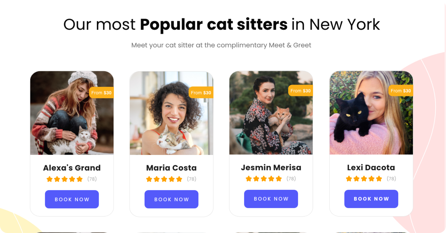
Enhanced Profile Information: Recognizing that sitter profiles were a primary decision-making tool, I redesigned them to be visually engaging and informative. Elements such as sitter ratings, reviews, and key qualifications were prominently displayed, making comparisons easier.
Decision Support: Added subtle design elements, such as “Top Rated” badges and testimonials, to guide users toward confident choices without overwhelming them.
Streamlined Process: The signup flow was redesigned to eliminate unnecessary steps and fields, focusing on essential information only. This change significantly reduced the cognitive load on users and directly addressed the drop-off points identified in user research.
Progressive Disclosure: The reservation process was broken down into simple steps, guiding users with clear, accessible prompts. By introducing information gradually, I created a manageable experience that increased flow completion rates.
Visual and Brand Assets: Staying true to the original mascot design, the new illustrations added warmth and charm to Meowtel’s branding, bringing more personality to the website and apps.
Email Templates: A fresh set of email templates provided a cohesive and delightful brand touchpoint in communications, designed to boost engagement and retention.

This project underscored the value of emotional design and user-centric solutions in enhancing marketplace experiences. The insights gained from user recordings and data were instrumental in streamlining flows and reducing hesitation. Looking forward, expanding usability testing would provide deeper insights, helping Meowtel continuously evolve to meet user needs.
Manage risk effectively and make informed trading decisions with our advanced portfolio management software for traders
A comprehensive case study on the redesign of the employee benefit

WashMix is a premier garment care provider, known for its high-quality, eco-friendly laundry and dry-cleaning services.
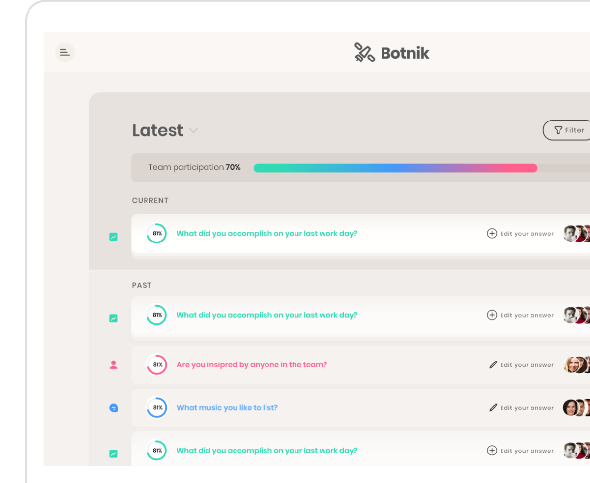
Botnik is a team-building app designed to foster empathy, transparency, and productivity within teams of any size.
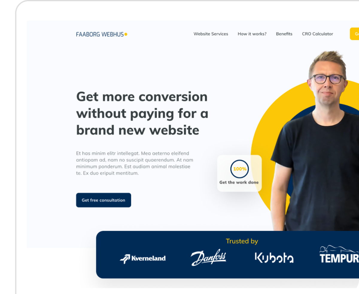
A remote webmaster services for B2B production and industry companies, ensuring secure, scalable, and fully supported websites.


