A comprehensive case study on the redesign of the employee benefit enrolment dashboard.
User Research
Wireframing
Prototyping
Usability Testing
Insurance
Vipin
Jan 2020
This project focused on redesigning the employee benefit enrollment dashboard to create a streamlined, user-friendly experience. The goal was to improve the overall usability, making it easier for employees to select and enroll in medical benefit plans. The new design provides an intuitive interface, a clear step-by-step process, and helpful tools to compare plans and complete the enrollment process smoothly.
The current benefits dashboard presents significant usability challenges, making it difficult for employees to navigate and complete their enrollment process efficiently. Users experience confusion about where to begin and how to select a plan, with plan comparisons lacking clarity, which complicates decision-making. Additionally, the multi-step enrollment process is cumbersome, particularly when enrolling in rider plans or uploading necessary documents, often leaving users without proper guidance. Furthermore, the opt-out button is inefficient, causing frustration among employees who wish to decline enrollment but struggle to clearly indicate their choice. These issues collectively hinder a seamless and user-friendly experience.
Old Design: The old layout did not make it clear where users needed to go to begin the enrollment process.
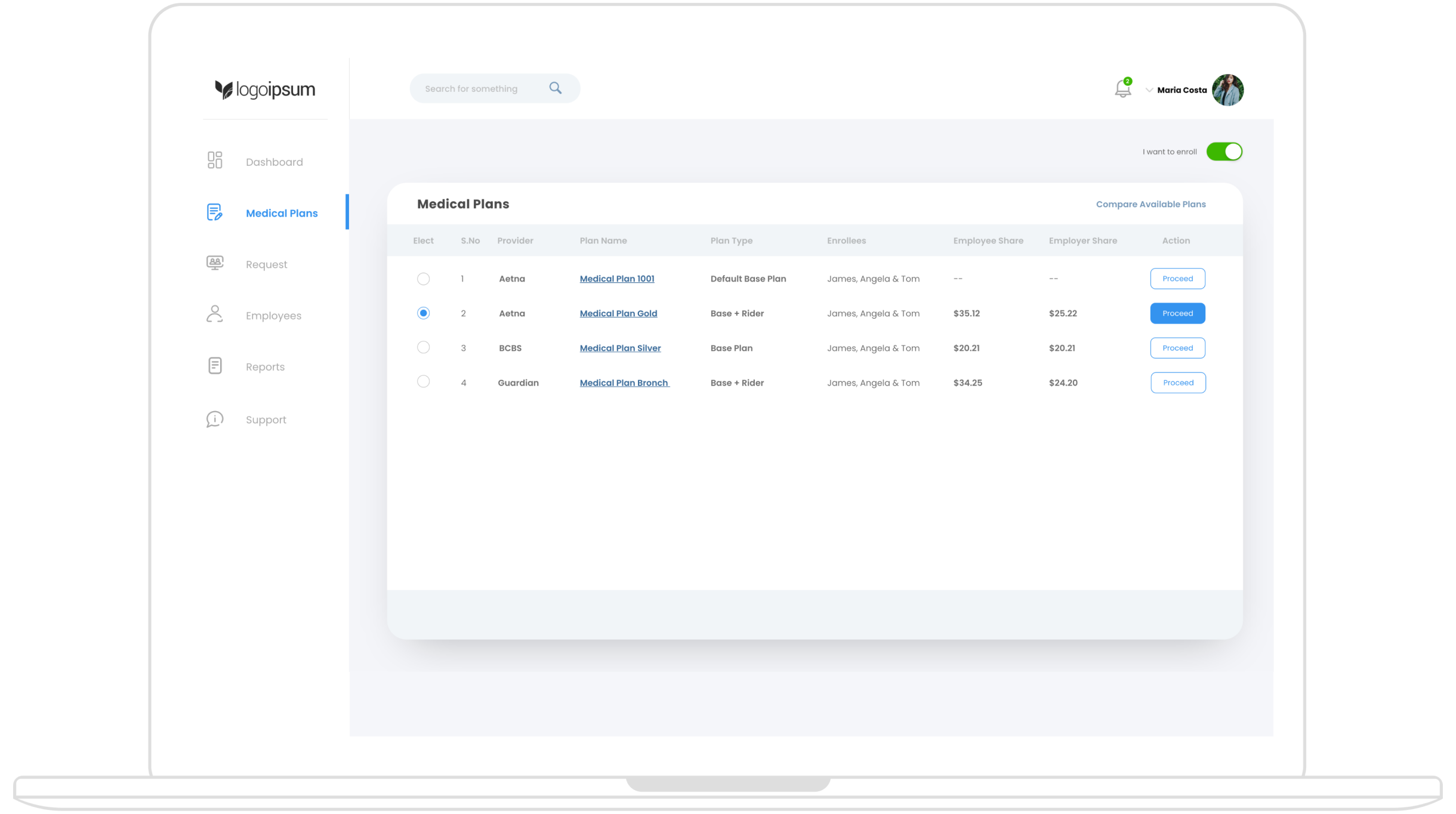
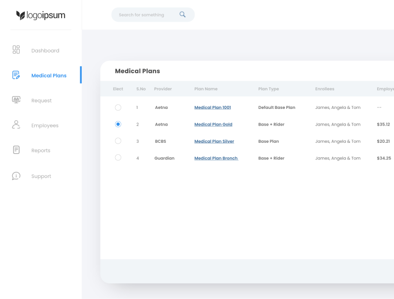
New design: The redesigned dashboard has a clean and intuitive layout, where employees, upon logging in, see a left navigation panel. From this panel, users can easily navigate to “Medical Plans,” which presents a list of available plans. This list includes essential details such as provider name, plan name, plan type, and enrollees, helping users quickly assess their options.
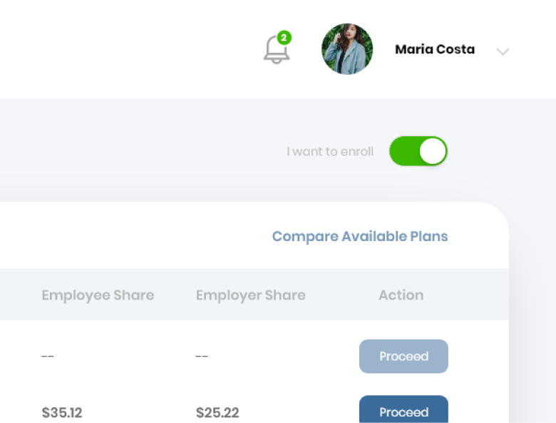
A toggle button at the top of the screen labeled "I want to enroll" is turned on by default. If employees wish to opt out, they can switch it off, which makes the process of opting out clear and accessible.
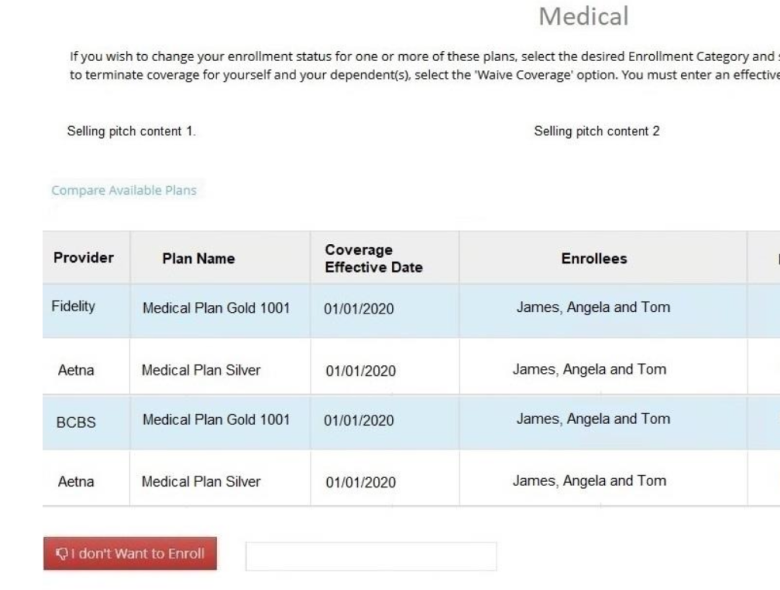
Old Design: TUsers found it difficult to compare different plans side by side
New design: I introduced a plan comparison feature on top right the plan listing. This allows users to compare key attributes of different medical plans, making it easier to decide on the best option before proceeding with enrollment. and accessible.
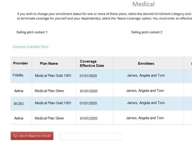
Old Design: The enrollment process was not well-defined, and users struggled to navigate multi-step plans or handle document uploads.
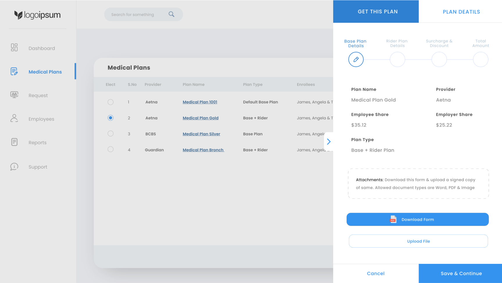
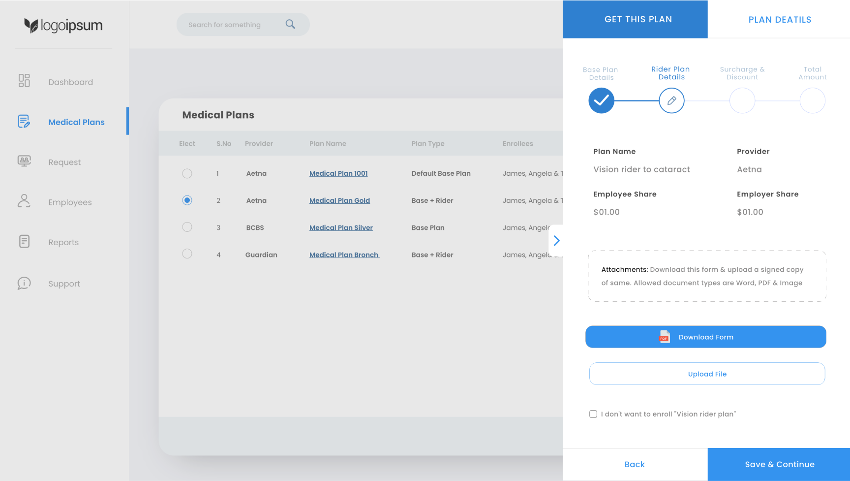
New design: The flow was redesigned to be clear and guided. After selecting a plan, employees click the "Proceed" button, which opens a side panel modal. This modal has two tabs:

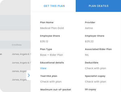
Employees review the base plan details. If the plan includes a rider, they will also see options to download the necessary forms. A button for uploading the signed copy of the form is provided to make the process seamless.
If applicable, the next screen provides details about the rider plan. Employees can review the information and, once ready, click “Save & Continue.”
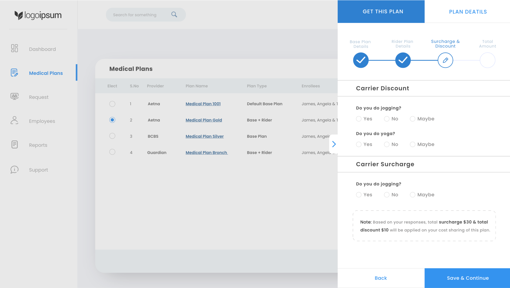
Employees are asked to answer a few questions related to discounts and surcharges based on carrier requirements. These questions are designed to be simple and easy to answer.
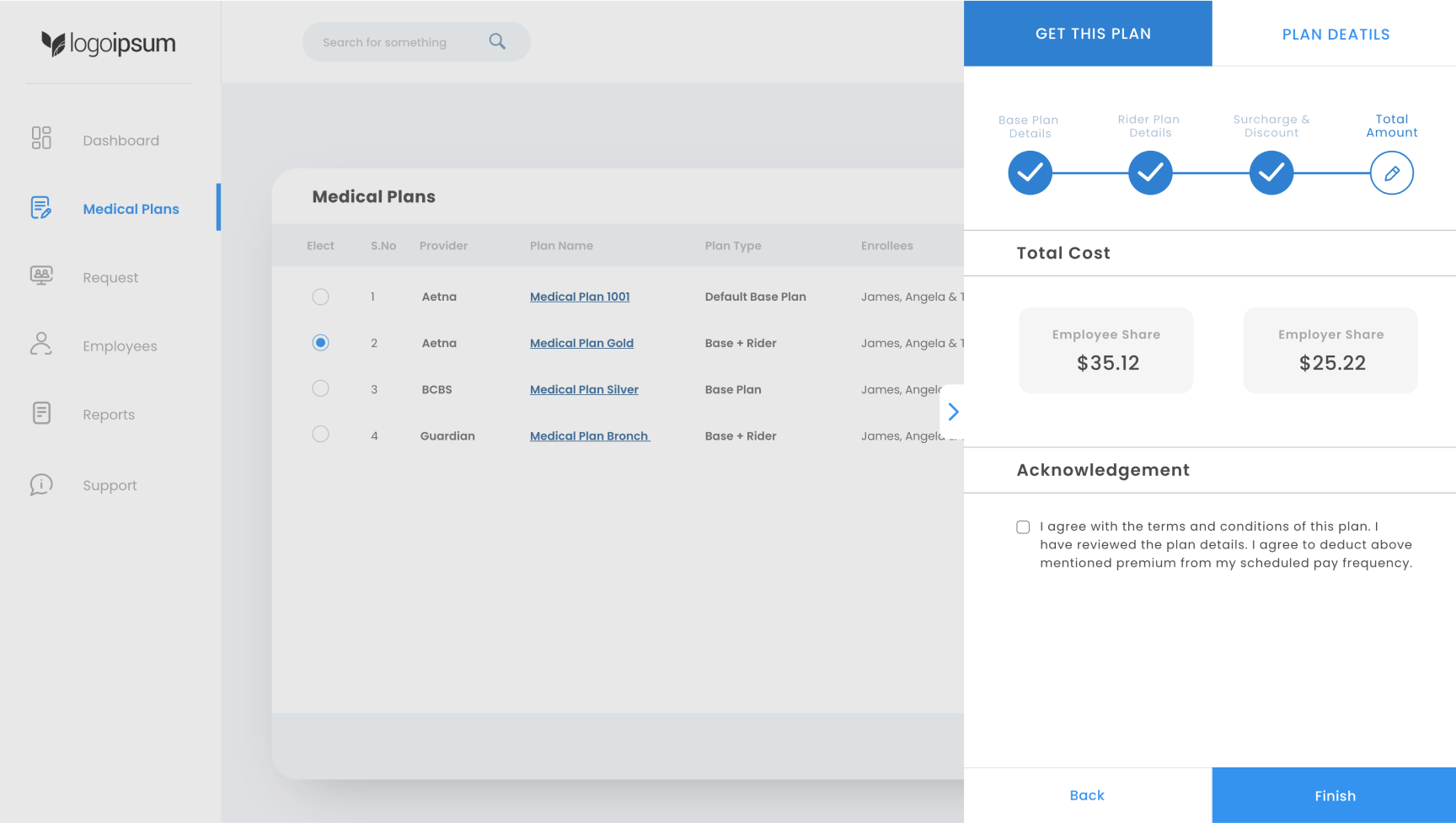
Employees see a summary of their total cost, including any applicable discounts or surcharges. After reviewing the cost breakdown, they can agree to the terms by checking a box and clicking “Finish” to complete the enrollment.
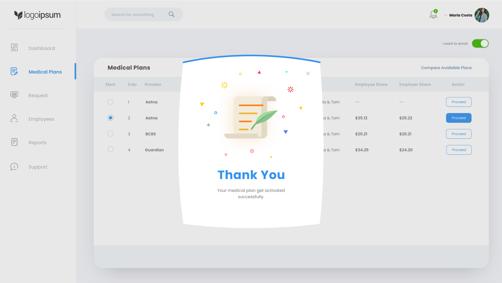
The employee has successfully completed the plan selection process.

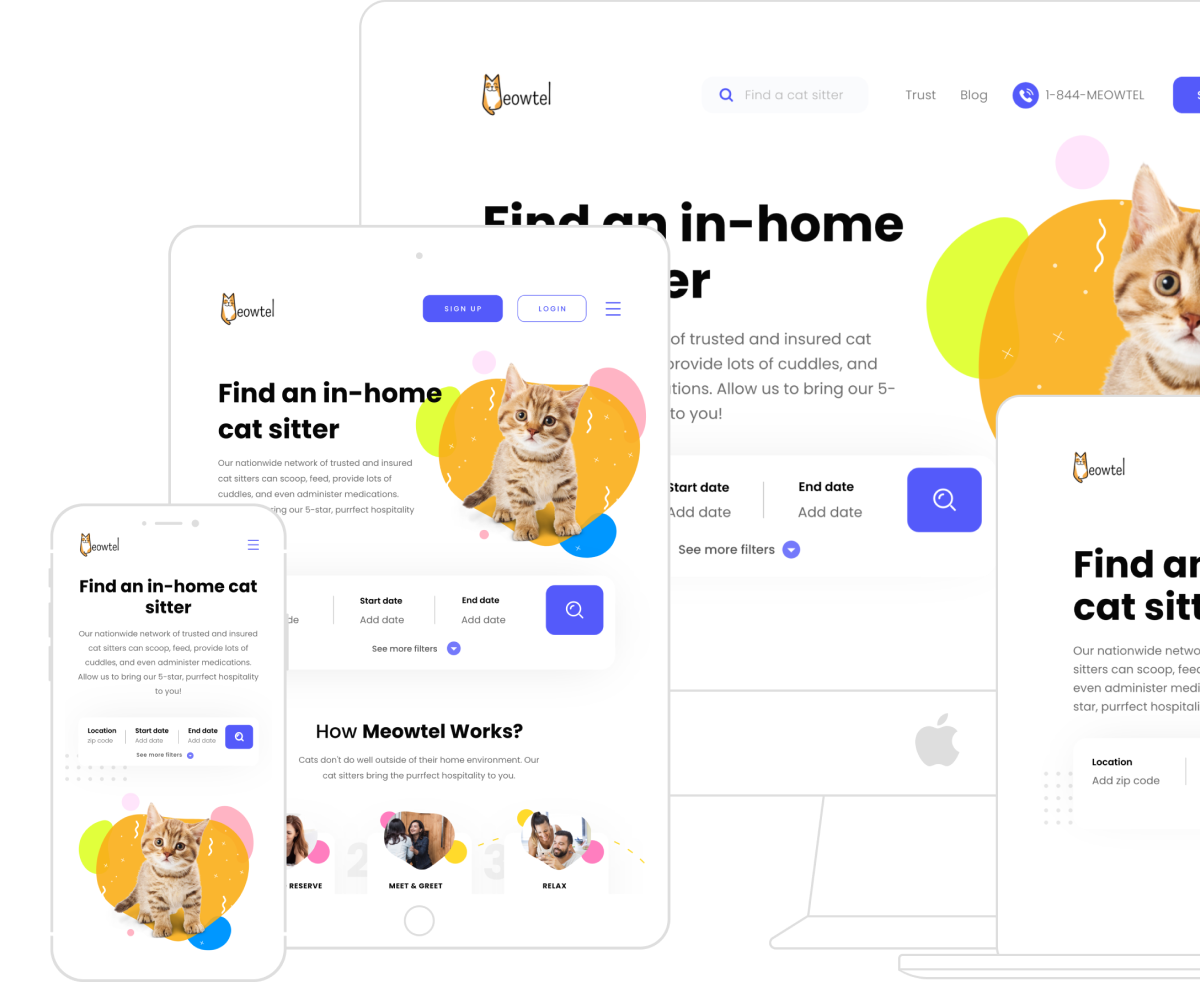
Meowtel is america’s 1st cat sitting app, trusted by thousands of cat lovers nationwide.
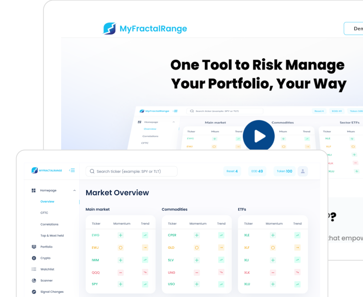
Manage risk effectively and make informed trading decisions with our advanced portfolio management software for traders

WashMix is a premier garment care provider, known for its high-quality, eco-friendly laundry and dry-cleaning services.
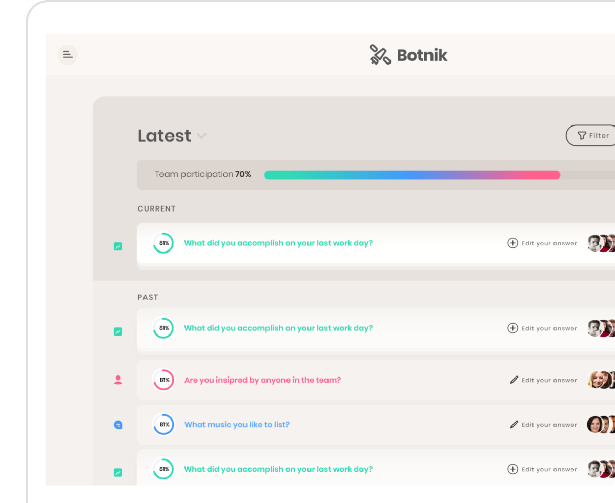
Botnik is a team-building app designed to foster empathy, transparency, and productivity within teams of any size.
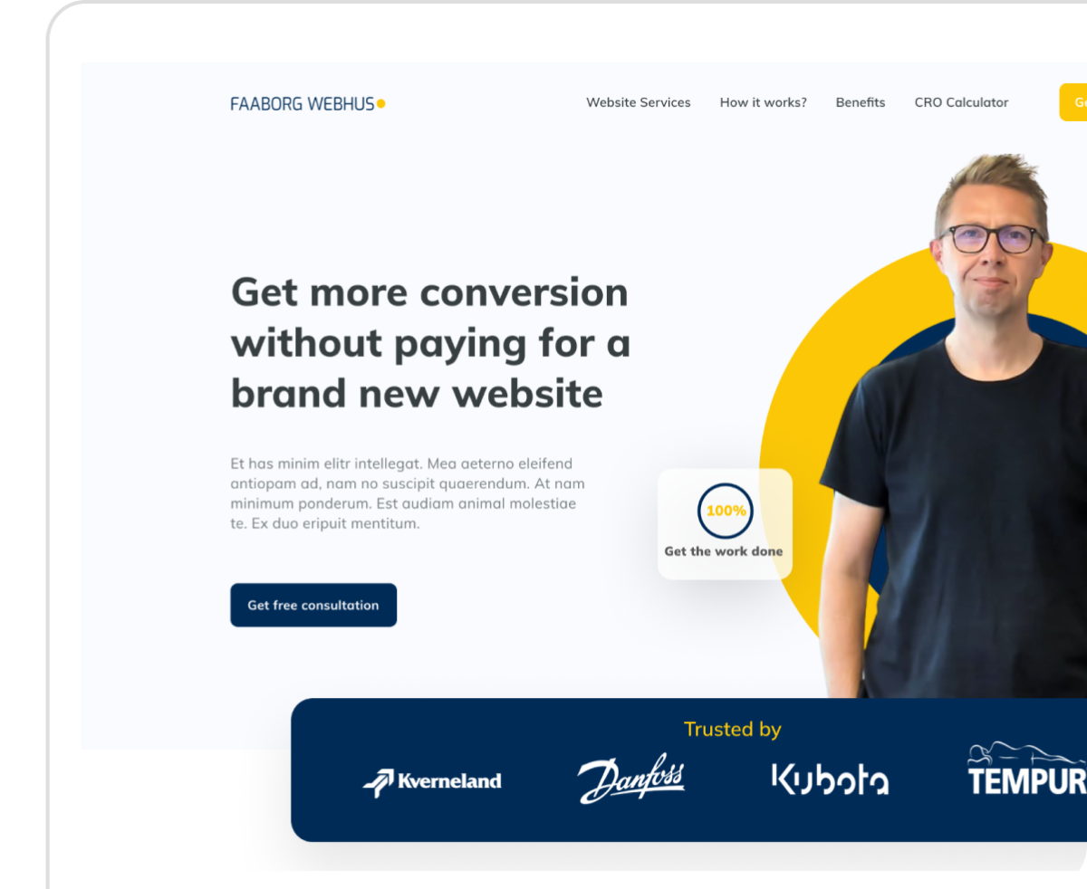
A remote webmaster services for B2B production and industry companies, ensuring secure, scalable, and fully supported websites.


